Open the folder you created for this course in Positron using Open > Open Folder… > Select your Folder.
Inside this folder, create a new Quarto document (tutorial8.qmd).1
For each question, include:
The question number and text
Your R code in a code chunk
Brief explanation of your approach (for conceptual questions)
Make sure your YAML-header (first lines of your .qmd document) look as approximately as follows:
---
title: Tutorial 8
format: html
author: Your Name And Student No.
---
Render your document to HTML to verify all code executes correctly (click on “Preview” in Positron.)
Part 1: Teacher Demonstration
A. Loading and Exploring Vector Spatial Data
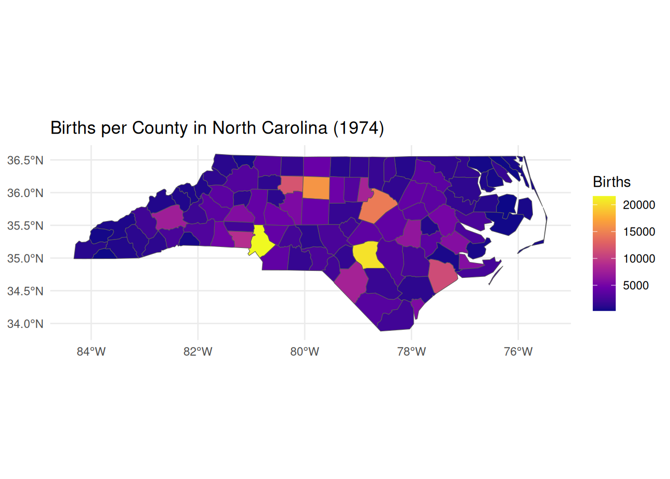
We begin with North Carolina county data included in the sf package—a classic dataset for spatial analysis. This demonstrates how spatial objects combine geometry with attribute data.
# Visualize births in 1974ggplot(nc) +geom_sf(aes(fill = BIR74)) +scale_fill_viridis_c(option ="plasma", name ="Births") +theme_minimal() +labs(title ="Births per County in North Carolina (1974)")
Key points:
Spatial data frames contain a special geometry column alongside regular attributes
CRS (Coordinate Reference System) defines how coordinates map to Earth’s surface
Standard dplyr verbs (select(), filter()) work seamlessly with spatial objects
geom_sf() in ggplot2 handles spatial visualization automatically
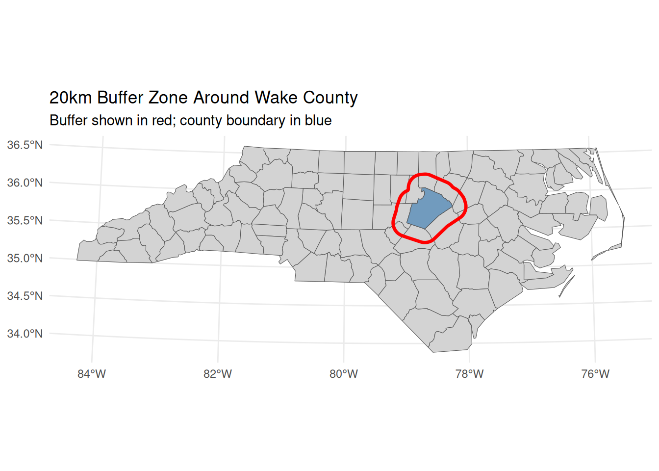
B. Coordinate Reference Systems and Geometric Operations
CRS management is critical for accurate distance/area calculations. We’ll transform coordinates and create buffers (zones of influence).
# Check current CRS (geographic coordinates in degrees)st_crs(nc)$input
[1] "NAD27"
# Transform to projected CRS for accurate distance calculations (meters)# EPSG:32119 = NAD83 / North Carolina (meters)nc_proj <-st_transform(nc, 32119)print(paste("New CRS:", st_crs(nc_proj)$input))
[1] "New CRS: EPSG:32119"
# Calculate area in square kilometers (requires projected CRS)nc_proj <- nc_proj |>mutate(area_km2 =as.numeric(st_area(geometry)) /1e6)# Create 20km buffer around Wake County (Raleigh)wake <- nc_proj |>filter(NAME =="Wake")wake_buffer <-st_buffer(wake, dist =20000) # 20km = 20,000 meters# Visualize bufferggplot() +geom_sf(data = nc_proj, fill ="lightgray") +geom_sf(data = wake, fill ="steelblue", alpha =0.7) +geom_sf(data = wake_buffer, fill =NA, color ="red", size =1.2) +labs(title ="20km Buffer Zone Around Wake County",subtitle ="Buffer shown in red; county boundary in blue") +theme_minimal()
Always transform to projected CRS before calculating distances/areas/buffers
st_buffer() creates zones of influence—critical for market area analysis
Buffers require distance units matching the CRS (meters for projected systems)
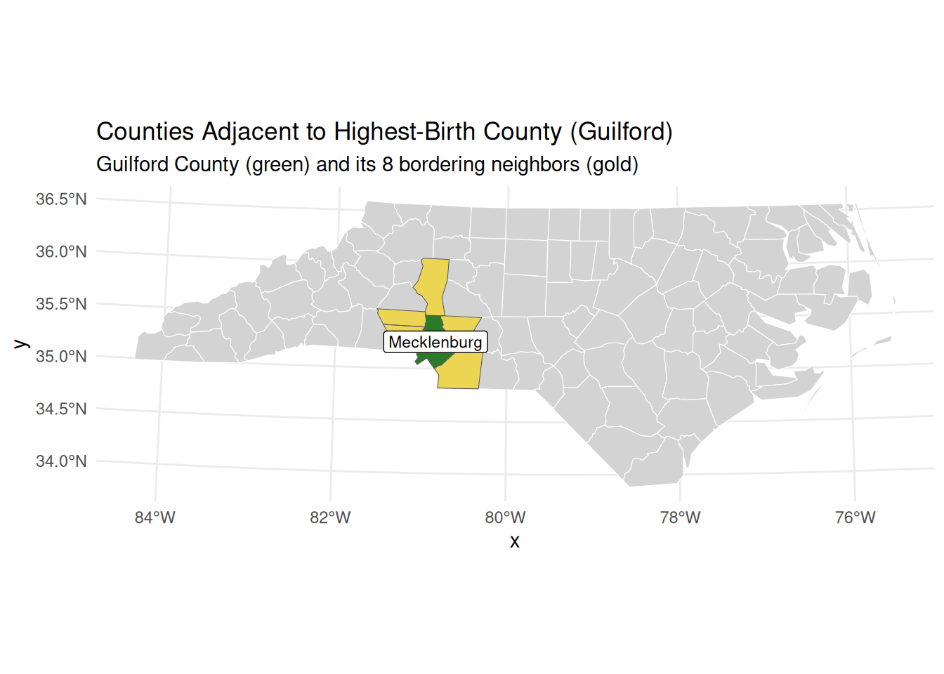
C. Spatial Topology and Neighborhood Analysis
Spatial topology identifies relationships between features (e.g., adjacency). We’ll find counties bordering the highest-birth county.
# Identify county with highest births in 1974highest_birth <- nc_proj |>slice_max(order_by = BIR74, n =1)print(paste("Highest birth county:", highest_birth$NAME))
[1] "Highest birth county: Mecklenburg"
# Find adjacent counties using st_touches()# Returns logical matrix: TRUE where geometries share boundaryadjacent_matrix <-st_touches(highest_birth, nc_proj, sparse =FALSE)# Extract adjacent countiesneighbors <- nc_proj[adjacent_matrix, ]# Build labels dynamically so they always match the dataplot_title <-sprintf("Counties Adjacent to Highest-Birth County (%s)", highest_birth$NAME)plot_subtitle <-sprintf("%s County (green) and its %d bordering neighbors (gold)", highest_birth$NAME, nrow(neighbors))# Visualize resultsggplot() +geom_sf(data = nc_proj, fill ="lightgray", color ="white") +geom_sf(data = highest_birth, fill ="darkgreen", alpha =0.8) +geom_sf(data = neighbors, fill ="gold", alpha =0.6) +geom_sf_label(data = highest_birth, aes(label = NAME), size =3) +labs(title = plot_title,subtitle = plot_subtitle) +theme_minimal()
Key points:
st_touches() identifies features sharing boundaries (adjacency)
Spatial predicates return sparse matrices by default (efficient for large datasets)
Topology enables analysis of spatial spillovers (e.g., policy diffusion across borders)
Visualization clarifies spatial relationships for interpretation
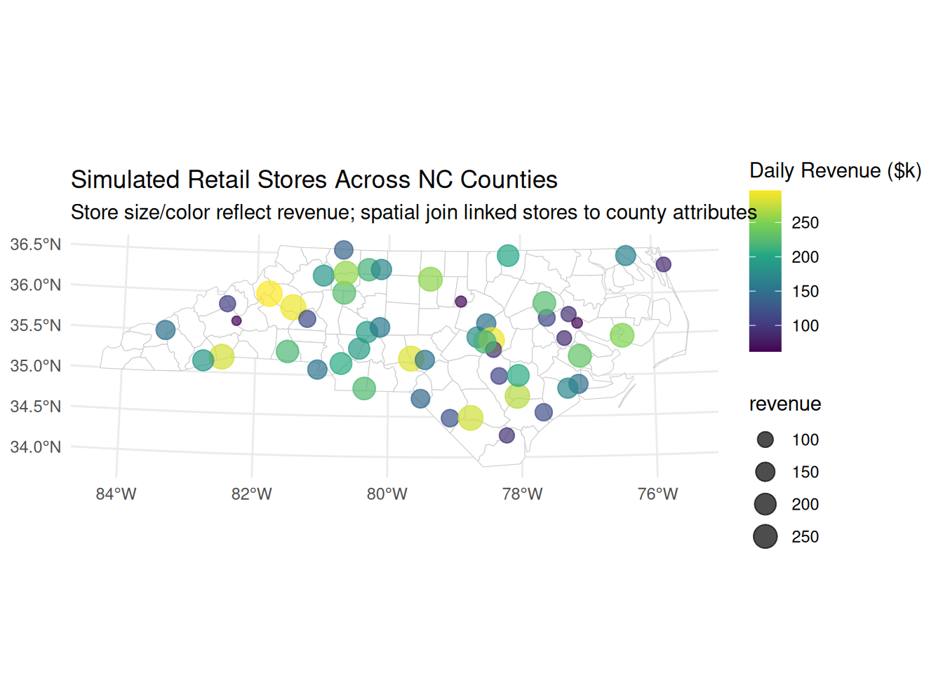
D. Spatial Joins and Real-World Application
Spatial joins link datasets without shared IDs by leveraging geometry. We’ll simulate retail stores and join them to county attributes.
# Simulate 50 retail store locations (points) across NCset.seed(123)stores <-st_sample(st_union(nc_proj), size =50) |>st_as_sf() |>mutate(store_id =1:50,revenue =runif(50, 50, 300)) # Simulated daily revenue ($k)# Spatial join: assign each store to its containing countystores_with_county <-st_join(stores, nc_proj)# Analyze revenue by birth rate quartilestores_with_county <- stores_with_county |>mutate(birth_quartile =ntile(BIR74, 4))# Compare average revenue across birth rate quartilesrevenue_by_quartile <- stores_with_county |>st_drop_geometry() |># Remove geometry for standard summarizationgroup_by(birth_quartile) |>summarise(avg_revenue =mean(revenue),n_stores =n())print(revenue_by_quartile)
# Visualize relationshipggplot(stores_with_county) +geom_sf(data = nc_proj, fill ="white", color ="gray80") +geom_sf(aes(color = revenue, size = revenue), alpha =0.7) +scale_color_viridis_c(name ="Daily Revenue ($k)") +scale_size_continuous(range =c(2, 6)) +labs(title ="Simulated Retail Stores Across NC Counties",subtitle ="Store size/color reflect revenue; spatial join linked stores to county attributes") +theme_minimal()
Key points:
st_join() performs attribute transfer based on spatial relationships (default: intersects)
Critical for economics when datasets lack common identifiers (e.g., firms → districts)
Enables analysis of spatial exposure (e.g., “Do stores in high-birth counties earn more?”)
Geometry must be dropped before standard dplyr aggregation
Part 2: Student Practice Questions
Data Fundamentals & CRS Management
Load the nc dataset. What is the difference between st_crs(nc)$epsg and st_crs(nc)$proj4string? Transform the dataset to EPSG:4326 and EPSG:32119. Which transformation changes the shape of counties more dramatically on a map? Explain why.
A buffer draws a circle of a given radius around a geometry — its catchment area. The radius you pass to st_buffer() is just a number, and its unit is the unit of the CRS. In a projected CRS measured in metres (EPSG:32119), st_buffer(x, 5000) therefore means a 5 km buffer.
Working in EPSG:32119:
Transform Buncombe County (NAME == "Buncombe") to EPSG:32119 and build a 5 km buffer around it.
Use st_area() to report (in km²) the area of the county itself and the area of the buffered county. How much extra catchment does the 5 km buffer add?
Plot the county (blue) on top of its buffer (semi-transparent red) to confirm the ring looks right.
buncombe <- nc |>filter(NAME =="Buncombe") |>st_transform(32119)buf <-st_buffer(buncombe, 5000) # 5000 metres, because EPSG:32119 is in metres
Now explain the CRS rule in your own words: why must you transform to a metre-based CRS before buffering, rather than buffering the county in its geographic (lon/lat) coordinates? What unit would the number 5000 represent if the layer were still in degrees?
Economic interpretation: A 5 km buffer is a simple model of a county’s economic catchment — the surrounding area whose firms and workers plausibly interact with it. Getting the radius in honest metres is what makes that catchment comparable across regions.
st_intersection() returns the geometry (and area) that two shapes share where they overlap. The catch is that both layers must live in the same coordinate reference system, so this question is really about the error you get when they don’t—and how to fix it.
Create two copies of nc:
nc_a transformed to EPSG:32119
nc_b transformed to EPSG:2264 (another NC projection)
Attempt to do st_intersection(nc_a[1,], nc_b[1,]). What error occurs? Fix it and compute the intersection area.
Vector Operations – Buffers, Centroids & Topology
A county’s st_centroid() is its single central point—a handy way to treat a whole area as one location, for example when asking whether that point falls inside a buffer.
Create a 25km buffer around the county with the highest 1979 birth rate (BIR79). Identify all counties whose centroids fall within this buffer (not just geometric intersection). How many counties qualify? Visualize with buffer (semi-transparent red), high-birth county (blue), and qualifying centroids (gold points).
A buffer can also grow inward: passing a negative distance to st_buffer(x, dist = -10000) shrinks a polygon by that many metres instead of expanding it, leaving a smaller shape nested inside the original.
Building on Q4:
Find all counties that touch (share a border with) the high-birth county
Create a 10km buffer inside the high-birth county boundary (use negative distance: st_buffer(..., dist = -10000))
Calculate what percentage of the high-birth county’s area lies within this “inner buffer” Economic interpretation: How might this represent a “core economic zone” versus peripheral areas?
Here we again reduce each county to its centroid (introduced in Q4), this time to measure how far apart counties are from centre to centre.
Calculate centroids for all NC counties. For each county, find its nearest neighbor by centroid distance (excluding itself). Which county pair has the smallest centroid-to-centroid distance? Which has the largest? Plot all counties colored by distance to nearest neighbor.
The previous version of this question asked for “population in distance rings,” but BIR74 is a county-level count glued to a polygon, not point-level population — so we cannot speak of people “residing in a ring” without machinery we have not covered. Instead, do a clean distance-band analysis using points.
Define a single center as a coordinate — Charlotte, at roughly lon = -80.84, lat = 35.23. Build it with st_as_sf(coords = c("lon", "lat"), crs = 4326) and then st_transform() it to EPSG:32119 (metres).
Scatter a few hundred random candidate sites across NC. Draw runif() longitudes and latitudes inside the state’s bounding box (st_bbox()), build them as an sf object in EPSG:4326, and keep only the points that actually fall inside North Carolina. Use a spatial join with st_intersects for this (so you never need st_sample). Watch the CRS: the built-in nc loads in NAD27, so transform it to EPSG:4326 before the join, or the join will error with st_crs(x) == st_crs(y) is not TRUE.
Transform the surviving points to EPSG:32119, compute each point’s st_distance() to the center, convert to kilometres, and use cut() to bin into 0-10, 10-25, 25-50, and >50 km bands. Then count() the points per band.
Economic interpretation: with uniformly scattered points, the count per band grows with distance simply because outer bands cover more land — this is the catchment-area logic behind gravity and market-access models, where a location’s reach expands with the radius you are willing to consider. It also serves as a spatial “null” baseline: genuine agglomeration would over-represent the inner bands relative to this uniform scatter.
Scaffolding to get you started:
center <-st_as_sf(data.frame(lon =-80.84, lat =35.23),coords =c("lon", "lat"), crs =4326) |>st_transform(32119)nc84 <-st_transform(nc, 4326) # match CRS for the join belowset.seed(42)bb <-st_bbox(nc84)pts <-data.frame(lon =runif(800, bb["xmin"], bb["xmax"]),lat =runif(800, bb["ymin"], bb["ymax"])) |>st_as_sf(coords =c("lon", "lat"), crs =4326)inside <-st_join(pts, nc84, join = st_intersects, left =FALSE) |>st_transform(32119)# ... compute st_distance() to center, cut() into bands, then count()
Identify counties that are completely disjoint (no border contact) with counties having above-median SID74 (SIDS deaths). What geographic pattern emerges? Hypothesize an economic mechanism that could explain health outcome clustering.
Spatial Joins & Real-World Applications
Two new tools help here: st_sample() scatters random points inside an area, and st_union() dissolves several polygons into a single combined shape.
Simulate 200 “pollution sources” as random points across NC. Create 5 circular pollution zones (buffers of varying radii: 5–30km) around randomly selected sources. Which counties intersect multiple pollution zones? Calculate total “exposure score” per county = sum of buffer areas overlapping the county.
Using the rnaturalearth library, retrieve two spatial datasets:
US state boundaries via ne_states(country = "United States of America", returnclass = "sf")
US populated places via ne_download(scale = 110, type = "populated_places", category = "cultural", returnclass = "sf")
Then filter the populated places to those inside the US, perform a spatial join to assign each city to its state, and answer the following:
Which state contains the most populated places in this dataset?
Calculate the average latitude of populated places per state2 and display the results sorted from northernmost to southernmost.
Simulate 150 firm headquarters as random points in NC counties. Assign each firm:
Revenue ~ Uniform($1M, $50M)
Industry (manufacturing/retail/services) with probabilities 0.3/0.4/0.3 Join firms to counties. Test whether manufacturing firms locate in counties with larger land area (st_area(geometry)) using a simple correlation.
A spatial regression discontinuity design compares outcomes on either side of a shared border, treating counties that touch as otherwise-similar neighbours so that a sharp jump across the boundary can be read as a discontinuity.
Identify all county pairs that touch using st_touches(nc, nc). For each touching pair, calculate:
Absolute difference in BIR74 (births)
Absolute difference in NWBIR74 (non-white births) Which border has the largest demographic discontinuity? Economic relevance: Spatial RD designs often exploit such discontinuities.
Extract and plot Band 4 (near-infrared) separately. Why is this band valuable for vegetation analysis in agricultural economics?
Using st_buffer() and st_point(), create a 500m-radius circle centered at coordinates (294000, 9116000) in the Landsat CRS. Crop the Landsat image to this circle. Calculate mean reflectance per band within the cropped area.
The key raster job is to summarise a raster down to polygons — one number per polygon — and then map it. Here you will compute each NC county’s exposure to summer heat. Load the North Carolina climate raster (12 monthly layers for 1999). Its CRS is not stored in the file, so you must set it before any spatial operation:
library(stars)climate <-read_stars(system.file("nc/bcsd_obs_1999.nc", package ="stars"), quiet =TRUE)st_crs(climate) <-4326# the file ships without a CRSnc4326 <-st_transform(nc, 4326) # match the raster's CRS before aggregating
The raster has two attributes — pr (precipitation) and tas (temperature). Working with temperature:
Select the tas attribute and the July 1999 layer (the 7th time step) with climate["tas"][ , , , 7].
Use aggregate(<raster slice>, nc4326, FUN = mean, na.rm = TRUE) to get the mean July temperature per county. (Coastal cells over the ocean are NA, hence na.rm = TRUE.)
Join the result back as a new column on nc4326 (the aggregated values come out in the same row order as the counties), then map it with geom_sf(aes(fill = ...)) and scale_fill_viridis_c(). Which counties are hottest, and where are they?
Economic interpretation: This per-county summer temperature is a measure of climate exposure — a candidate explanatory variable for outcomes like agricultural yields, energy demand, or labour productivity across counties.
Advanced Integration & Economics Applications
Using geodata (install if needed):
library(geodata)
Loading required package: terra
terra 1.9.27
temp <-worldclim_country(country ="Netherlands", var ="tavg", path =tempdir())
Convert to stars object and extract January 2020 temperature
Get Dutch province boundaries via rnaturalearth::ne_states("Netherlands")
Calculate mean January temperature per province
Economic question: How would you link this to provincial GDP data to test climate-economy relationships?
The previous version of this question asked for a contiguity weights matrix, row-standardisation, and a spatial lag \(\sum_j w_{ij}\,\text{BIR74}_j\) — that is spatial econometrics, which we have not covered. We keep the same spillover intuition with the tools you know, using st_touches().
Take the county with the highestBIR74 (use slice_max(); for reference this is Mecklenburg, home to Charlotte).
Use st_touches(focal, nc_proj, sparse = FALSE) to find the counties that share a border with it, and subset nc_proj to those neighbours.
Compute the meanBIR74 of those bordering neighbours and compare it to the focal county’s own BIR74. How much higher is the focal county than its local environment?
(Optional) Map the focal county and its neighbours, e.g. focal in one colour and the bordering counties in another, with the rest of the state as a light backdrop.
Economic interpretation: the neighbour-average is a simple, intuitive measure of a county’s local environment, and the gap between a county and its neighbours is a transparent stand-in for spatial spillover — no weights matrix or matrix algebra required. Mecklenburg towers over its neighbours, the signature of a single dominant urban core surrounded by smaller counties.
“Erasmus University Rotterdam” Convert results to sf points. Calculate straight-line distance between them in kilometers (transform to appropriate UTM zone first). Buffer each point by 2km and identify overlapping area.
Extract temperature for January 1, 1999 and January 31, 1999
Calculate temperature change per location over January 1999
Economics link: How could this data proxy for agricultural shock exposure?
This is a small simulation exercise: we invent an outcome that depends on treatment and spillover, then use a simple lm() to recover those effects and see whether the estimates match the values we built in.
Using the nc dataset, designate counties with BIR74 > 80th percentile as “treatment” (received pro-natalist policy)
Create 50km buffer around treatment counties = spillover zone