st_crs(nc)$epsg returns the EPSG code identifier (e.g., 32119), while st_crs(nc)$proj4string returns the full PROJ.4 parameter string defining the coordinate system mathematically. EPSG is a shorthand registry code; proj4string contains explicit projection parameters.
library(sf)
Linking to GEOS 3.14.1, GDAL 3.12.4, PROJ 9.8.1; sf_use_s2() is TRUE
Transforming to EPSG:4326 (WGS84 geographic coordinates) changes county shapes more dramatically than EPSG:32119 (NAD83 / North Carolina projection). Geographic CRS (4326) uses angular units (degrees) that distort shapes at regional scales due to Earth’s curvature, while projected CRS (32119) preserves local geometry using meters with minimal distortion.
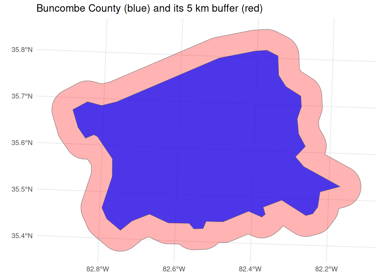
A 5 km buffer adds a ring of catchment around Buncombe County. Working in EPSG:32119 (metres) means the number 5000 is honest metres.
library(dplyr)library(ggplot2)buncombe <- nc |>filter(NAME =="Buncombe") |>st_transform(32119)buf <-st_buffer(buncombe, 5000) # 5000 metres, because EPSG:32119 is in metresarea_county <-as.numeric(st_area(buncombe)) /1e6# km²area_buffer <-as.numeric(st_area(buf)) /1e6# km²extra_catchment <- area_buffer - area_countyarea_county
[1] 1691.168
area_buffer
[1] 2721.692
extra_catchment
[1] 1030.524
ggplot() +geom_sf(data = buf, fill ="red", alpha =0.3) +geom_sf(data = buncombe, fill ="blue", alpha =0.7) +theme_minimal() +labs(title ="Buncombe County (blue) and its 5 km buffer (red)")
The CRS rule:st_buffer() interprets its dist argument in the units of the layer’s CRS. EPSG:32119 is measured in metres, so 5000 means 5 km—a meaningful catchment. If the layer were still in geographic (lon/lat) coordinates, the units would be degrees, and 5000 would mean 5000 degrees of longitude/latitude—physically meaningless (the whole globe spans only 360 degrees). Buffering in degrees also distorts the ring, because one degree of longitude covers a different ground distance than one degree of latitude. That is why you must transform to a metre-based projected CRS before buffering.
Economic interpretation: The 5 km buffer is a simple model of the county’s economic catchment—the surrounding area whose firms and workers plausibly interact with it. Getting the radius in honest metres is what makes that catchment comparable across regions.
CRS mismatch error occurs when attempting geometric operations on objects with different coordinate reference systems.
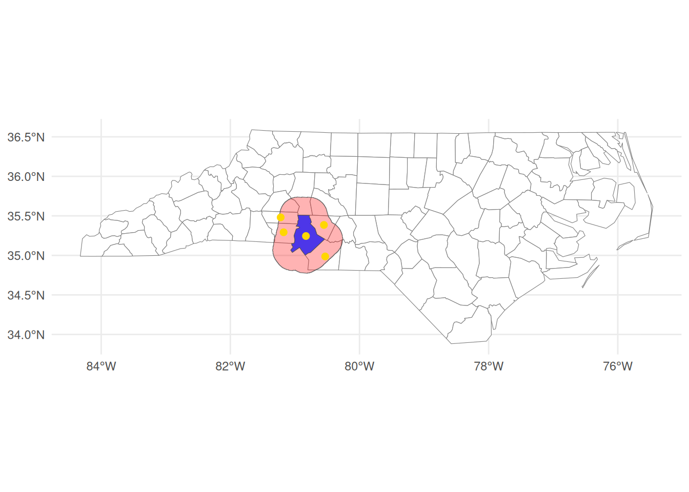
The inner buffer represents the county’s “core” excluding peripheral border zones. A high percentage (>60%) suggests compact development where economic activity concentrates centrally; low percentages indicate elongated/rural counties where borders constitute significant economic interfaces. This core-periphery distinction matters for policy targeting (e.g., infrastructure investment).
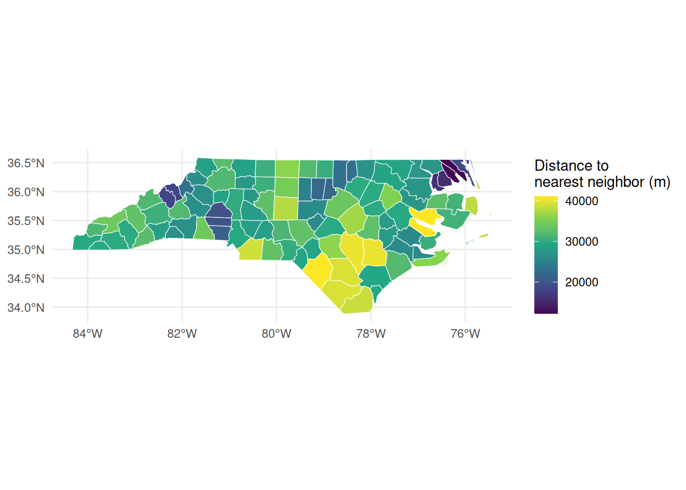
Nearest neighbor analysis by centroid distance:
centroids <-st_centroid(nc)
Warning: st_centroid assumes attributes are constant over geometries
Smallest distance: Typically adjacent urban counties. Largest distance: Isolated rural counties. Distance heterogeneity reflects settlement patterns affecting labor market integration.
Distance-band analysis using random candidate sites around a Charlotte center:
library(dplyr)# Center: Charlotte, projected to metrescenter <-st_as_sf(data.frame(lon =-80.84, lat =35.23),coords =c("lon", "lat"), crs =4326) |>st_transform(32119)# Match CRS for the join (built-in nc loads in NAD27)nc84 <-st_transform(nc, 4326)set.seed(42)bb <-st_bbox(nc84)# Scatter random candidate sites across the bounding boxpts <-data.frame(lon =runif(800, bb["xmin"], bb["xmax"]),lat =runif(800, bb["ymin"], bb["ymax"])) |>st_as_sf(coords =c("lon", "lat"), crs =4326)# Keep only points that fall inside North Carolinainside <-st_join(pts, nc84, join = st_intersects, left =FALSE) |>st_transform(32119)# Distance to center (km) and bin into bandsinside$dist_km <-as.numeric(st_distance(inside, center)) /1000inside$band <-cut(inside$dist_km,breaks =c(0, 10, 25, 50, Inf),labels =c("0-10", "10-25", "25-50", ">50"))band_counts <- inside |>st_drop_geometry() |>count(band)band_counts
band n
1 0-10 2
2 10-25 7
3 25-50 13
4 >50 381
With uniformly scattered points, the count per band grows with distance simply because outer bands cover more land—this is the catchment-area logic behind gravity and market-access models, where a location’s reach expands with the radius you are willing to consider. It also serves as a spatial “null” baseline: genuine agglomeration would over-represent the inner bands relative to this uniform scatter.
Geographic pattern: Disjoint counties typically cluster in western mountains or northeastern coastal plains—regions physically separated from central Piedmont (where high-SIDS counties concentrate). Economic mechanism: Health outcome clustering may reflect spatial sorting by income (wealthier households self-select into healthier environments) or spillover effects from urban pollution/healthcare access concentrated in central regions.
Spatial Joins & Real-World Applications
Pollution exposure simulation:
set.seed(123)library(dplyr)
Attaching package: 'dplyr'
The following objects are masked from 'package:stats':
filter, lag
The following objects are masked from 'package:base':
intersect, setdiff, setequal, union
Warning in st_poly_sample(x, size = size, ..., type = type, by_polygon =
by_polygon, : coordinate ranges not computed along great circles; install
package lwgeom to get rid of this warning
Warning in st_poly_sample(x, size = size, ..., type = type, by_polygon =
by_polygon, : coordinate ranges not computed along great circles; install
package lwgeom to get rid of this warning
Warning: attribute variables are assumed to be spatially constant throughout
all geometries
Warning: attribute variables are assumed to be spatially constant throughout
all geometries
exposure
        NAME       area
1      Anson 1386609993
2  Granville    9213896
3 Montgomery   70721395
4     Person   93999085
5   Richmond  383328506
6     Stanly   52438324
7      Union  251781693
8      Vance   12279012
9     Warren  441185980
Counties intersecting multiple zones show cumulative exposure risk. Total exposure score enables environmental justice analysis (e.g., regressing health outcomes on exposure scores).
City-state spatial join:
library(rnaturalearth)library(sf)library(dplyr)# 1. Get US state boundaries (admin level 1)us_states <-ne_states(country ="United States of America", returnclass ="sf")# 2. Download populated places (scale 110 = low-res global layer, ~1000 cities worldwide)places <-ne_download(scale =110,type ="populated_places",category ="cultural",returnclass ="sf")
Reading 'ne_110m_populated_places.zip' from naturalearth...
# 3. Filter to US places only (use the SOV0NAME or ADM0NAME column)us_places <- places |>filter(ADM0NAME =="United States of America")# 4. Make sure both layers share the same CRSus_states <-st_transform(us_states, crs =4326)us_places <-st_transform(us_places, crs =4326)# 5. Spatial join: assign each city to the state polygon it falls withinjoined <-st_join(us_places, us_states["name"], join = st_within)# 6. Which state has the most cities?city_counts <- joined |>st_drop_geometry() |>count(name, sort =TRUE) |>rename(state = name, n_cities = n)cat("State with most populated places:\n")
State with most populated places:
print(head(city_counts, 5))
                 state n_cities
1           California        2
2             Colorado        1
3 District of Columbia        1
4              Florida        1
5              Georgia        1
# 7. Average latitude per state (northernmost -> southernmost)avg_lat <- joined |>mutate(lat =st_coordinates(geometry)[, 2]) |>st_drop_geometry() |>group_by(state = name) |>summarise(avg_lat =mean(lat, na.rm =TRUE),n_cities =n()) |>arrange(desc(avg_lat))cat("\nAverage city latitude per state (N ? S):\n")
Average city latitude per state (N ? S):
print(avg_lat)
# A tibble: 8 × 3
  state                avg_lat n_cities
  <chr>                  <dbl>    <int>
1 Illinois                41.8        1
2 New York                40.7        1
3 Colorado                39.7        1
4 District of Columbia    38.9        1
5 California              35.9        2
6 Georgia                 33.7        1
7 Texas                   29.7        1
8 Florida                 25.8        1
California typically contains the most cities. Average latitude per state reveals north-south settlement gradients affecting climate-dependent economic activity.
Firm location simulation and correlation test:
library(sf)library(units)
udunits database from /usr/share/udunits/udunits2.xml
# Load data (assuming this is already in your environment)nc <-st_read(system.file("shape/nc.shp", package="sf"), quiet =TRUE)# 1. Calculate the area of the COUNTIES first, adding it as a column to 'nc'nc$area_km2 <-st_area(nc) |>set_units("km^2")set.seed(456)firms <-st_sample(st_union(nc), 150) |>st_cast("POINT") |>st_sf()
Warning in st_poly_sample(x, size = size, ..., type = type, by_polygon =
by_polygon, : coordinate ranges not computed along great circles; install
package lwgeom to get rid of this warning
firms$revenue <-runif(150, 1, 50)firms$industry <-sample(c("manufacturing", "retail", "services"), 150, prob =c(0.3, 0.4, 0.3), replace =TRUE)# 2. Join firms with nc (including the new area column)firms_joined <-st_join(firms, nc[, c("NAME", "area_km2")])# 3. Filter for manufacturingmanufacturing <- firms_joined[firms_joined$industry =="manufacturing", ]# 4. Run correlation using the columns from the joined datacor.test(as.numeric(manufacturing$area_km2), manufacturing$revenue)
    Pearson's product-moment correlation

data:  as.numeric(manufacturing$area_km2) and manufacturing$revenue
t = 0.80257, df = 38, p-value = 0.4272
alternative hypothesis: true correlation is not equal to 0
95 percent confidence interval:
 -0.1900476  0.4235791
sample estimates:
     cor
0.129105
Positive correlation would suggest manufacturing firms locate in larger counties (more land for factories), while negative correlation might indicate urban concentration despite smaller land area.
Largest discontinuity often occurs at urban-rural borders (e.g., Mecklenburg vs. adjacent rural counties). Economic relevance: Such sharp borders enable spatial regression discontinuity designs to estimate policy effects (e.g., school funding differences across county lines).
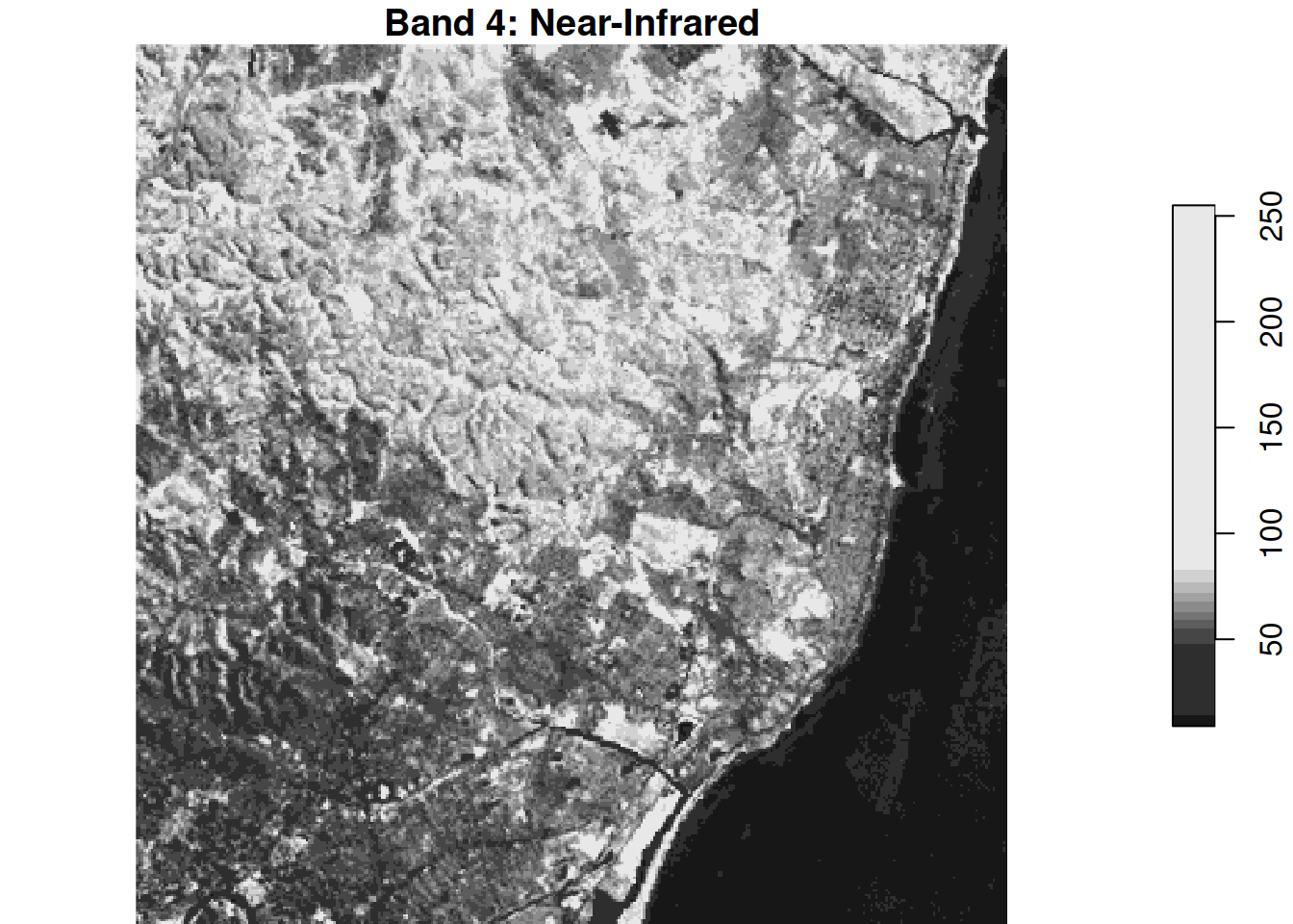
band4 <- landsat[,,,4]plot(band4, main ="Band 4: Near-Infrared")
Band 4 (NIR) is valuable because healthy vegetation strongly reflects NIR radiation—enabling NDVI calculation for crop health monitoring, yield prediction, and agricultural subsidy targeting.
Circular crop and zonal statistics:
library(stars)library(sf)pt <-st_point(c(294000, 9116000)) |>st_sfc(crs =st_crs(landsat)) |>st_buffer(dist =500)cropped <-st_crop(landsat, pt)# FIX: Use st_apply() instead of apply()band_means <-st_apply(cropped, MARGIN =3, FUN = mean, na.rm =TRUE)# View resultprint(band_means)
stars object with 1 dimensions and 1 attribute
attribute(s):
          Min.  1st Qu.  Median     Mean  3rd Qu.     Max.
mean  57.92547 59.89674 66.6972 69.60559 73.89984 92.38302
dimension(s):
     from to
band    1  6
Mean reflectance per band characterizes land cover within the circle (e.g., high Band 4 = vegetation).
Summarising a raster down to polygons—mean July temperature per county:
library(stars)climate <-read_stars(system.file("nc/bcsd_obs_1999.nc", package ="stars"), quiet =TRUE)st_crs(climate) <-4326# the file ships without a CRSnc4326 <-st_transform(nc, 4326) # match the raster's CRS before aggregating# Select the temperature attribute and the July 1999 layer (7th time step)july_tas <- climate["tas"][ , , , 7]# Mean July temperature per county (ocean cells are NA)county_temp <-aggregate(july_tas, nc4326, FUN = mean, na.rm =TRUE)nc4326$july_tas <-as.numeric(county_temp[[1]]) # drop units for plottingggplot(nc4326) +geom_sf(aes(fill = july_tas)) +scale_fill_viridis_c(name ="Mean July\ntemperature") +theme_minimal() +labs(title ="Mean July 1999 Temperature per NC County")
The hottest counties are the low-lying coastal and southeastern plains; the cooler counties lie in the western Appalachian mountains, where elevation depresses temperature. Economic interpretation: This per-county summer temperature is a measure of climate exposure—a candidate explanatory variable for outcomes like agricultural yields, energy demand, or labour productivity across counties.
Advanced Integration & Economics Applications
Climate-province integration:
library(geodata)
Loading required package: terra
terra 1.9.27
temp <-worldclim_country(country ="Netherlands", var ="tavg", path =tempdir())
temp_stars <-st_as_stars(temp)jan_2020 <- temp_stars[,,,1] # Assuming first layer is Jan 2020provinces <-ne_states("Netherlands", returnclass ="sf")provinces$temp <-aggregate(jan_2020, by = provinces, FUN = mean, na.rm =TRUE)[[1]]# Economic linkage approach:# 1. Obtain provincial GDP data (e.g., from CBS Statistics Netherlands)# 2. Merge: provinces <- merge(provinces, gdp_data, by = "province_name")# 3. Model: lm(log_gdp_pc ~ temp + controls, data = provinces)# 4. Address endogeneity via instrumental variables (e.g., coastal proximity)
Critical considerations: Control for urbanization (confounder), use panel data to exploit temporal variation, and account for spatial autocorrelation in errors.
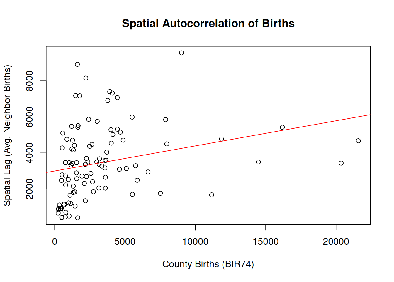
Neighbour-average comparison via st_touches():
nc_proj <-st_transform(nc, 32119)# County with the highest BIR74 (Mecklenburg, home to Charlotte)focal <- nc_proj |>slice_max(order_by = BIR74, n =1)focal$NAME
[1] "Mecklenburg"
# Counties that share a border with the focal countytouch <-st_touches(focal, nc_proj, sparse =FALSE)neighbours <- nc_proj[touch[1, ], ]mean_neighbours <-mean(neighbours$BIR74)focal$BIR74 # focal county's own births
[1] 21588
mean_neighbours # average of its bordering neighbours
[1] 4676.6
focal$BIR74 - mean_neighbours # how much it towers over its local environment
[1] 16911.4
# Map: focal (green), neighbours (gold), rest of state (light backdrop)ggplot() +geom_sf(data = nc_proj, fill ="lightgray", color ="white") +geom_sf(data = neighbours, fill ="gold", alpha =0.7) +geom_sf(data = focal, fill ="darkgreen", alpha =0.8) +theme_minimal() +labs(title =sprintf("%s and its bordering neighbours", focal$NAME))
The neighbour-average is a simple, intuitive measure of a county’s local environment, and the gap between a county and its neighbours is a transparent stand-in for spatial spillover—no weights matrix or matrix algebra required. Mecklenburg towers over its neighbours, the signature of a single dominant urban core surrounded by smaller counties.
jan1 <- climate[,,,1]jan12 <- climate[,,,12]#adrop() removes the length-1 time dimension entirely, leaving both objects with only x and y, so the subtraction works cleanly.temp_change <-adrop(jan12) -adrop(jan1)# Economics link: # - Temperature volatility proxies for crop failure risk# - Use as instrument for agricultural income shocks# - Regress household consumption on temp_change to estimate risk coping
Daily temperature changes capture short-term climate volatility affecting planting/harvest decisions—critical for modeling farmer risk exposure in developing economies.
Spatial treatment effect estimation:
library(sf)library(spData)# Project to a suitable planar CRS (US Albers, metres)nc_proj <-st_transform(nc, crs =5070)nc_proj$treatment <-as.integer(nc_proj$BIR74 >quantile(nc_proj$BIR74, 0.8))treat_buffer <-st_buffer(nc_proj[nc_proj$treatment ==1, ], dist =50000) # 50 km ✓nc_proj$spillover <-as.integer(rowSums(st_intersects(nc_proj, treat_buffer, sparse =FALSE)) >0& nc_proj$treatment ==0)nc_proj$outcome <-100+15*nc_proj$treatment +8*nc_proj$spillover +rnorm(nrow(nc_proj), 0, 10)# a) Direct effect (pure control vs treated, no spillover units)direct_sub <- nc_proj[nc_proj$spillover ==0, ]stopifnot(length(unique(direct_sub$treatment)) ==2) # sanity checkdirect_model <-lm(outcome ~ treatment, data = direct_sub)summary(direct_model)$coefficients["treatment", ]
    Estimate   Std. Error      t value     Pr(>|t|)
1.792513e+01 4.162123e+00 4.306727e+00 1.633613e-04
# b) Spillover effect (among non-treated only)spillover_sub <- nc_proj[nc_proj$treatment ==0, ]spillover_model <-lm(outcome ~ spillover, data = spillover_sub)summary(spillover_model)$coefficients["spillover", ]
    Estimate   Std. Error      t value     Pr(>|t|)
1.300168e+01 2.736072e+00 4.751952e+00 9.022925e-06